From Se7en to Blade Runner 2049, we bring you 22 movies with the best cinematography that offer valuable lessons.
A beautiful cinematic experience is one in which visually striking imagery blends in effortlessly with other aspects of film production — story, characters and sound design. Almost as if they were all one single cohesive unit. Not different from a dazzling painting where the viewer although aware of its individual items is held by the impact of their combined artistry, undistracted by their lone makeup.
Great cinematography has the same captivating effect on its audience immersing their imagination into a singular story without standing out on its own. In the words of Roger Deakins,
To me if there’s an achievement to lighting and photography in a film it’s because nothing stands out, it all works as a piece. And you feel that these actors are in this situation and the audience is not thrown by a pretty picture or by bad lighting.
We browsed through the works of some of the most notable cinematographers to bring you a list of the best movies for cinematography. Presented in no specific order, these visually beautiful movies were chosen for their aesthetic quality over plot and storytelling.
Watch: Blade Runner 2049 Explained
1. Citizen Kane (1941)

Cinematographer: Gregg Toland
One of the most important chapters in cinema history is understanding how Orsen Welles and Gregg Toland’s collaboration for Citizen Kane impacted cinematography once and for all. The film narrates the rise and fall of a publishing magnate named Charles Foster Kane. When Toland came aboard for the project, Welles emphasized that he wanted to tell this story without utilizing Hollywood’s visual conventions. This led to the innovation of ‘deep focus’ technique. Deep Focus simultaneously keeps all the elements of an image – foreground, middle ground, and background – in sharp focus.
Citizen Kane is not the first film to use deep-focus cinematography. Films like Osaka Elegy (1936), Stage Coach (1939) and The Rules of the Game (1939) had already used this technique. But Welles’ supreme ability to stage multiple actions within a single frame offered a lot of intimate details and meaning to the central character’s life journey. Deep focus was later used by great filmmakers like Akira Kurosawa, Jacques Tati, and Stanley Kubrick. Citizen Kane was also known for Toland’s highly expressive ways of lighting a set.
2. Tokyo Story (1953)

Cinematographer: Yûharu Atsuta
The legendary Japanese filmmaker Yasujiro Ozu’s camera would often be in the same position, it would rarely move. Ozu and his long-time collaborator Yûharu Atsuta built a special base to hold the camera three feet above the floor. The point of view would be a little lower than a person sitting on a tatami in a Japanese-style room. Each beautifully composed shot would look like a still-photograph and the unique camera angle would push the viewer to feel like they are in the room. This intimacy between characters and viewers, created by Ozu and Atusta, gradually matured in their post-war films.
Tokyo Story tells the melancholic tale of elderly parents visiting their busy grown-up children living in the city. The static camera allows us to totally absorb the setting in each frame, forcing us to find beauty and sadness in the moments. Another brilliant innovation of Ozu was known as ‘pillow shots’. Instead of using a conventional establishing shot, Ozu often cuts to recurring and poetic images such as railroad crossing, clothesline, and industry smoke stacks to emotionally prepare the viewer for the next scene.
3. Pather Panchali (1955)

Cinematographer: Subrata Mitra
Subrata Mitra is often described to be the perfect cinematic eye of the great Satyajit Ray. Having previously worked on films like Devi and Charulata, they were both known for their vivid imagination. So, it should come as no surprise that one of Ray’s best feature films, Pather Panchali features Mitra’s visuals. He was able to create a distinct visual language, making exquisite use of the idyllic rural setting. The bountiful sun cuts across the film in multiple instances, indicative that some scenes were shot on the brightest days.
In direct contrast to these vibrant frames, Mitra gives us a monsoon sequence cloaked in darkness. All the figures immediately transform into ghostly blurs. In the aftermath of this onslaught, we’re made aware of how close to the edge Apu’s family had been living. The reason we’re all left so drained, both mentally and emotionally is because we’ve grown attached to these characters.
4. Barry Lyndon (1975)

Cinematographer: John Alcott
A lot of shots in Stanley Kubrick’s magnum opus seem like a magnificent oil painting. Barry Lyndon was the second of the three collaborations between Kubrick and renowned British cinematographer John Alcott. The film revolves around an 18th century rogue, who weasels his way into the aristocratic class through marriage, and gets caught in the era’s political conflicts. Kubrick observes his titular character from an ironic distance. This he achieves through the brilliant and languorous zoom-outs, where his protagonist’s smallness with respect to the larger conflicts is constantly perceived. The slowness of camera movements also emphasizes the noble class’ pace of life.
Moreover, many beautiful frames in Barry Lyndon were inspired by the ethereal paintings of John Constable and Thomas Gainsborough. Perhaps the most astounding aspect of the cinematography is the scene that was lit by candle light alone. This was before the digital age. They couldn’t have achieved the effect in post-production. So, Kubrick and Alcott borrowed a lens from NASA, which gave a depth of field to the scene while shooting in such low light.
5. Se7en (1995)

Cinematographer: Darius Khondji
Ace director David Fincher and cinematographer Darius Khondji bring the deadly sins to screen in Se7en. In the initial rounds of discussion, both Fincher and Darius agreed that the film had to look frightening. To accomplish this, Se7en maintains a dark, claustrophobic tone throughout the film. The visuals are compelling but distressing. Retaining the rich black tones involved extensive pre-processing of the negatives and chemical treatment of the film. Khondji demonstrates his mastery over lighting with each shot being perfectly composed. He comes up with inventive ways to capture the bleak atmosphere of the film, like the evocative use of flashlights for instance.
Even in what was Fincher’s darkest work to date, Khondji somehow manages to infuse some warmth. What makes all of this more impressive is the fact that it was achieved in an analog fashion using film as opposed to turning up a dial on a modern digital camera.
6. Saving Private Ryan (1998)

Cinematographer: Janusz Zygmunt Kamiński
Very few films have managed to capture the visceral horror as thoroughly as Steven Spielberg’s war epic Saving Private Ryan. The 25-minute long opening sequence is particularly harrowing. It’s one of the most realistic battle scenes ever depicted on film. It was a massive undertaking involving more than 750 extras. Janusz Kamiński shot it using handheld cameras over the course of four long weeks.
There was an extended pre-production period where Kamiński spent more than two weeks performing camera tests and deciding on a color palette. It was in one of these discussions between Spielberg and Kamiński that it was decided not to use Technicolour. This time also allowed Kamiński to read the script and form an idea of how he was going to light the film. It’s this instinctive thinking that allows him to create such memorable visuals.
7. Amélie (2001)

Cinematographer: Bruno Delbonnel
Recipient of the Pierre Angénieux ExcelLens honor, Bruno Delbonnel shot to fame and Oscar glory with Amélie. In a short span of time, he’s been nominated five times for an Academy Award for best cinematography. His signature soft, diffused frames and distinctive color palette became the talk of the town. It’s now become so unique that critics call a similar lighting style as Delbonnel-esque. Bruno first managed to do this in Amélie by exposing the raw stock to light right before using it in a camera to shoot the film.
One of the things that stands out in Amélie is extensive use of sepia and sunlight as an indicator of the character’s mind-frame. He also experimented a lot with lensing, eventually settling down on wide-angle lenses. This artistic decision allows the background to be in focus so that the audiences can take in the opulent set design, thus providing a subtle charm to the proceedings.
8. The Aviator (2004)

Cinematographer: Robert Richardson
The Aviator was Richardson and Martin Scorsese’s third film together following Casino and Bringing Out The Dead. Richardson makes use of period lighting techniques and a distinct color palette to capture each era of Hughes’ life. The distinct color palette was a result of mixing two or three stripes of black and white negatives together. Scorsese was adamant about recreating the Technicolor which graced many of the Hollywood films that were released in Hughes’ time.
Richardson who’s known to not take his projects lightly put his life at stake while shooting for The Aviator. In one scene where Leonardo Di Caprio crashes the XF-11 plane, Richardson could feel the flames engulfing him. Even though he had fireproof attire on, the heat could have probably caused some serious damage. It’s a miracle that he emerged unscathed from the accident. It’s this fierce commitment to his art that makes Richardson one of the most sought-after cinematographers in the industry.
9. Pan’s Labyrinth (2006)

Cinematographer: Guillermo Navarro
Guillermo del Toro’s Pan’s Labyrinth is a dark fantasy and a coming-of-age tale that revolves around a young girl in the aftermath of the Spanish Civil War. The film has parallel narratives where the protagonist moves between the real and fantasy world. This brought a set of unique challenges to cinematographer Guillermo Navarro. Initially the young girl’s fantasy features warm colors, including golden ambers. Gradually though, the fantasy turns bleaker. Both del Toro and Navarro share a love of darkness.
Navarro limited the use of natural light in most of the setting. He carefully added a little light source and bounce boards to bring a sharp image out of the shadows. In this way, Navarro and del Toro created a visual pathway to connect the grim reality and the darkly mysterious magical space. The initial color differentiation between the two worlds is lost as the young girl is left to navigate her way through the emotional labyrinth. Pan’s Labyrinth also has scenes set in densely forested areas, for which Navarro and crew smartly used an illuminated balloon light to float over the space and light it from above.
10. The Assassination of Jesse James by the Coward Robert Ford (2007)

Cinematographer: Roger Deakins
The Assassination of Jesse James by the Coward Robert Ford marked Roger Deakins‘ foray into Westerns. His stunning work helps us immerse ourselves into a world that Roger Hansen envisioned in his historical novel. Creating this distinctive look required extensive scouting for locations. Since the plot required snow for certain scenes, Roger’s team had to keep revising their schedules. In fact, an entire town was built up in the Rockies for some scenes towards the end of the film.
One of the most memorable movie scenes of the film is the train robbery that happens towards the beginning of the film. Andrew Dominik wanted to shoot it in a large train, but budgetary constraints meant that they needed to improvise. A remote town in Edmonton with a smaller train and a little loop of railway was used instead. Roger uses only a single light held in the front of the train to light up the entire frame. Additional lighting came only in the form of lanterns held by the characters within the shot. His camera work lends the train a much larger presence visually.
11. The Dark Knight (2008)

Cinematographer: DP Wally Pfister
DP Wally Pfister‘s work in The Dark Knight is not just a sight to behold, but more importantly, helps tell the distressing tale of the master of chaos, The Joker. Just like his earlier films with Christopher Nolan (Memento, Insomnia, Inception) Wally chooses to keep his camera work grounded in reality. A large part of Batman Begins is shrouded in darkness, much like Batman himself. But, Nolan inverts that trope in The Dark Knight and finds dramatic reasons for Wayne to be seen in broad daylight. One particular scene plays with the idea of light and dark really well. The interrogation scene with Heath Ledger starts off in a dark room and later switches to a brighter environment, which is almost over-exposed as a light switch is flipped on.
Wally hasn’t yet caved into the pressure of going digital. He finds film to be of higher quality and believes that it gives him more latitude than a cheap camera. The first 28 minutes of The Dark Knight was shot on IMAX which lent the film a more immersive feel.
12. Slumdog Millionaire (2008)

Cinematographer: Anthony Dod Mantle
Anthony Dod Mantle’s win at the Oscars was seen as a major push towards digital filmmaking as a large part of the film was shot digitally. Danny Boyle and Anthony were no strangers to digital, they’d earlier worked with a digital camera in 28 Days Later. Danny wanted to shoot on location and he felt that the larger 35mm rigs would draw unwanted attention. The objective was to capture the spirit of the mood of crowded Mumbai streets and the Dharavi slums. Anthony felt that the smaller SI-2K would be perfect for this.
Another major challenge to Anthony and his team was the recreation of India’s version of Who Wants to Be a Millionaire. The lighting and camera work involved are unfamiliar to most styles. The show was central to the film’s plot, so it was crucial that the crew get it right. This was done by the use of bright colors and dynamic shadows which also served as a mirror to the vibrant lives of its characters. It’s this collective effort that landed Anthony his first Oscar for Best Cinematography.
13. Tron: Legacy (2010)

Cinematographer: Claudio Miranda
Disney’s 1981 sci-fi film Tron has secured its place as a pioneering visual effects-driven film with its extensive use of computer graphics. So, it was always going to be a big ask to design and shoot a follow-up. But, Claudio Miranda proved that he was more than up for the task. He teamed up with Digital Domain, a visual effects house that he’d worked on earlier in Fincher’s The Curious Case of Benjamin Button. The team decided to shoot the entire film in 3D after learning that converting 2D visuals to 3D wasn’t really going to cut it. This played a large part in creating a more immersive environment.
Miranda’s objective was to create two different looks in the film, a warmer real world, and a much cooler digital world. The digital world was lighted to reflect the costumes that the characters wear. In one particular sequence where Cora and Sam come face to face, we can observe them giving off the light to each other. Standard lights were replaced with evanescent fluorescents to create a futuristic look. In addition to that, they also had to contend with the heavy 3D camera systems which hindered movement. This inconvenience was solved by creating an inverted motion control rig allowing more mobility.
14. The Tree of Life (2011)

Cinematographer: Emmanuel Lubezki
Terrence Malick and Emmanuel Lubezki first worked together in The New World. While working on this film, both of them would sketch out a series of rules that has now evolved into a guiding principle for all of their projects together. Some of the parameters mentioned in the “dogma” includes shooting with available natural light, avoiding lens flares and no zooming. Lubezki stated that working with a predetermined set of rules helps him stay focused on capturing the narrative and not get lost among the endless possibilities.
Lubezki and Malick took the same approach to their second film together using a mix of 35mm, 65mm and the more expansive IMAX format. Most scenes are lit with natural light through windows, tree canopies or wide doorways. Meanwhile, Jack’s childhood is exclusively covered in vignettes. Sticking to their instinct helped achieve the highest resolution possible as The Tree of Life went to draw top honours in the Cannes Film Festival.
15. Birdman (2014)

Cinematographer: Emmanuel Lubezki
Emmanuel Lubezki won his second Oscar for Best Cinematography in a row. He’d earlier won for his excellent work in Alfonso Cuaron’s Gravity. Lubezki made a name for himself with long takes (think Tree of Life, Children of Men) and we get to see more of the same in Birdman. This was achieved by combining a number of long takes and making the transition seem as seamless as possible.
It wasn’t easy for Lubezki’s team to create this illusion. A single ten-minute shot took multiple rehearsals as the crew figured out where to hide the camera strategically in order to hide the transitions. But, Lubezki and Iñárritu realized that they would need the help of special effects to pull off some of the trickier transitions. Birdman was mostly filmed in a labyrinthine set, with some additional location work at Broadway’s St. James Theatre.
But, that wasn’t the only good thing about the cinematography. Birdman uses bold colors like red, blue, and green. One of the best memorable scenes in the film is the middle of Time Square, which required Lubezki to work around the city’s artificial lighting. The lights needed to be hidden from the frames which needed extensive post-production work and editing.
16. The Grand Budapest Hotel (2014)
Cinematographer: Robert D Yeoman
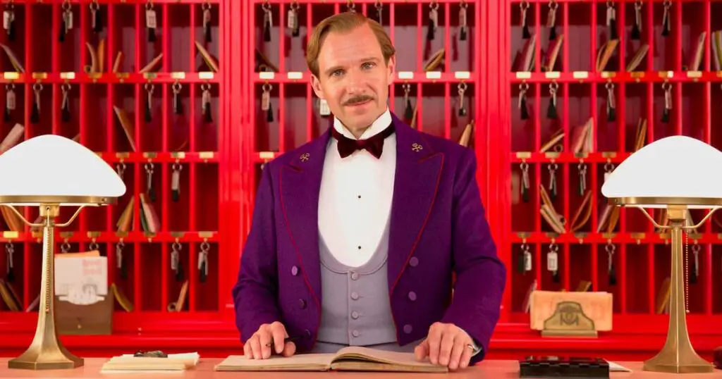
Like Robert D Yeoman’s previous movies with Wes Anderson (Bottle Rocket, The Royal Tenenbaums, Moonrise Kingdom) The Grand Budapest Hotel is aesthetically pleasing, steeped in a wildly original illustrative style. Wes prefers to draw from real-world references to create his own world. There’s usually a lot of room for interpretation in his films. We see that here too as the Fascists in power aren’t technically shown to be Nazis.
During the pre-production phase, Wes and Robert scouted for locations in and around Germany and Poland. There’s a lot of painstaking research that goes into the shot division as Wes used hand-written frames to build the structure of a scene. He also maintained an extensive library of visual references to make Robert’s job a whole lot easier. Their working relationship allows Robert to find more and more inventive ways to frame a shot. A telescopic camera platform called Towercam was used in place of the traditional crane to shoot certain sequences like when the inmates stage an audacious prison break. Read Color Psychology in Movies: How Films Use Colors To Tell A Story
17. The Revenant (2015)

Cinematographer: Emmanuel Lubezki
Emmanuel Lubezki scored a hat-trick of Oscar wins with Alejandro Iñárritu’s The Revenant. The first two came for Gravity and Birdman in 2013 and 2014. respectively. I speculate that a large part of why the Academy deemed him worthy of a record Oscar was the extensive use of natural lighting. It’s never easy shooting in nature given how unpredictable the weather can be. But, it’s this bold move that makes The Revenant stand out from Lubezki’s earlier works. It makes for an incredibly immersive experience as we feel like we’re taking this journey along with the characters. One particular scene that took audiences by surprise was the bear attack which I imagine would have taken months of rehearsing and planning. The way the scene was shot amplifies the inherent shock of the attack.
What makes Lubezki’s work so complicated and worthy of praise is that there isn’t a written manual to capture a moment. It’s all instinctive. He’s processing all this information while working with the natural elements to ensure that they stay true to the director’s vision.
18. La La Land (2016)

Cinematographer: Linus Sandgren
One gets the feeling that Linus Sandgren’s impeccable work was overlooked amidst the battle between La La Land and Moonlight for Best Picture. Director Damien Chazelle particularly liked Linus’s camera work in American Hustle which often swirled around its characters, mirroring their frantic internal state. Sandgren revealed in an interview that one of the things they talked about was how they wanted the camera to tell the story in an interactive way.
In La La Land, Linus Sandgren treats his camera like a musical instrument with a rhythm of its own, lending the songs a heightened, almost magical feel. This lines up perfectly with the idea of musicals long being seen as an escape from reality. The aesthetic that mimics the technicolor of Old Hollywood makes us feel instantly nostalgic. Damien and Linus use colors to signify character development. When we first see Mia, there’s eye-popping color everywhere indicating her desire to be associated with the glitz and glamour of Hollywood. Meanwhile, Sebastian’s room is shown in monochrome, indicating his intentions of staying true to his art. This play of colors continues throughout the film giving us a clear idea of their identities.
Linus would spot the light on a character as the camera moved in on them to give us the sense that they were performing on stage. He uses long continuous shots to reinforce that all of this is happening for real despite the dream-like backdrop. These artistic decisions had me convinced that this is Linus’ best work yet.
19. Blade Runner 2049 (2017)
Cinematographer: Roger Deakins
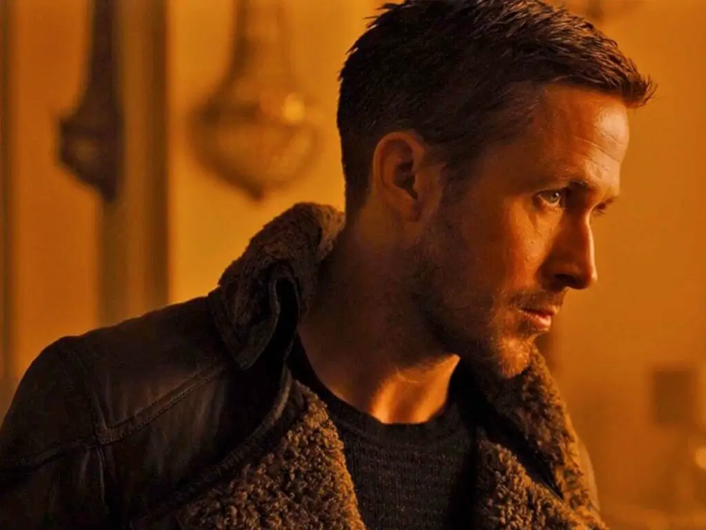
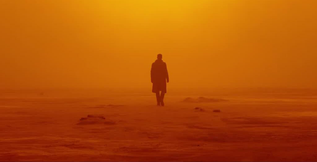
After a slew of nominations, (13 to be precise) Roger Deakins finally won an Oscar for Best Cinematography for his ground-breaking work in Blade Runner 2049. This was Denis Villeneuve’s sequel to the beloved Ridley Scott sci-fi classic. With the script picking up the story from the original, Roger had to meticulously recreate the visual language of the 1982 film. His take on the distinctive world of Blade Runner would involve the use of organic lighting and idiosyncratic geometric patterns. Roger uses darkness not just for the sake of it, but intelligently to play around with our knowledge. Take the storm scene towards the end of the film. We know that they’re on the sea, but we’re only revealed much later about how deep the water body is.
Yet another talking point of Blade Runner 2049 is its unique visual palette. Think of the intense red, dusty atmosphere surrounding the Las Vegas sequence. Denis and Deakins worked together and storyboarded the whole film before shooting was slated to commence. They dissected every scene and talked about the kind of colors that could be used in each scene. Here are 15 similar movies like Blade Runner for sci-fi fans.
20. Roma (2018)

Cinematographer: Alfonso Cuarón
Roma was initially meant to be shot by Cuarón’s frequent collaborator Emmanuel Lubezki. Their last project together Gravity won Emmanuel Lubezki his first Oscar. Unfortunately, due to scheduling conflicts, Lubezki was forced to leave the project. Instead of hiring another cinematographer, Cuarón decided to don the hat of DoP.
Roma is Cuarón’s most personal film to date and the visuals speak for themselves. In fact, it was inspired by Cuaron’s childhood and the maids that helped raise him. As a fitting ode to the past, the film is shot entirely in black and white. But, he doesn’t opt for a vintage look, instead lets his visuals take a more naturalistic tone. Lubezki’s influence lingers on the film with its long, elaborately choreographed tracking shots.
One of the most visually striking shots is the New Year’s Eve scene where we can see flames in the background. Cuarón wanted the shot to be illuminated by actual fire. So, the burning trees in the frame are all real. Humongous flaming grills suspended from tripods were used to illuminate the scene further.
21. 1917 (2019)
Cinematographer: Roger Deakins
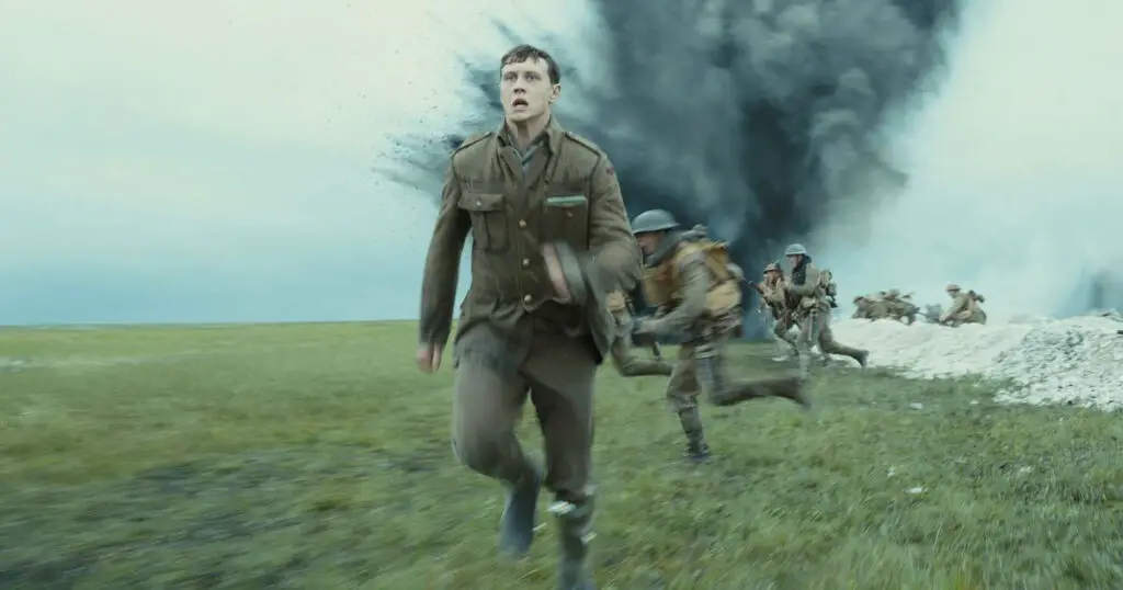
Roger Deakins picked up his second Oscar for his disruptive work in 1917. 1917 was filmed to look like one continuous shot. But, this wasn’t a mere narrative gimmick. It was in line with the vision of the film which follows a pair of young soldiers who’re trying to deliver a message to stop an imminent attack. Roger Deakins and director Sam Mendes had to come up with innovative ways to keep up the illusion. Cameras were attached to vehicles and sometimes the actors were followed on foot. Getting a single shot right required incredible amounts of planning and the most precise of timing.
Just like in the case of Birdman, proxy sets had to be constructed for the crew to rehearse. Each set needed to be able to accommodate the camera’s path. Tunnel entrances, for instance, needed to be of the exact length to make way for the camera. Mendes said that they wouldn’t build a set until they knew exactly how long it should be.
Instead of carrying around heavy equipment, Roger used a new model of high-definition cameras giving him images of a higher quality while also being able to move around easily. Moreover, a heavier camera might not have worked with the stabilizers the crew had.
1917 also won an Oscar for Best Visual Effects and the BAFTA Award for Cinematography among several other accolades that year.
22. Parasite (2019)

Cinematographer: Hong Kyung-pyo
Hong Kyung-pyo’s work in Bong-Joon Ho’s Parasite is a masterclass in depicting class divides. Hong builds upon Bong’s meticulously designed storyboards and uses lighting to impact how we view the characters. The mansion is bathed in warm-hued natural light while the sunlight only enters through a tiny window in the cramped basement. Hong decided to fill up the basement with tungsten incandescents and cheap fluorescents to mimic the look of a Korean household.
In addition to this, Hong and Bong use physical elements in the location to depict the divide between the rich and poor. You can notice windows or texture in glasses in multiple frames that split the frame. Staircases also act as a symbol of social class throughout the film. In a number of instances, characters are seen either climbing up or down the stairs indicating a promotion and demotion in status respectively. Bong revealed in an interview that Hitchcock’s use of stairs in Psycho had a large influence on the film.
Conclusion
Beauty may lie in the eyes of the beholder, but you’ll agree that we can watch these films on mute. One can argue that cinema is much more than style. However, spellbinding cinematography gracefully draws a viewer into the scene, and makes it easy for them to connect with the characters and their struggles. In fact, the aforementioned films are great examples of how mastering all the aspects of composition can elevate the narrative to new heights. Of course, this may not be an exhaustive, all-inclusive list of the best visual movies out there but it should inspire your color palettes or aesthetic choices when you make your next film. Let us know what we missed and if you have any recommendations in the comments below.
Additional writing by Arun Kumar

