Frequently touted as one of the most groundbreaking and angst-ridden shows aimed at teens in recent times, Euphoria is an instantly recognisable visual phenomenon. It has spawned looks and an associated aesthetic that is wildly expressive, often bordering on surreal. Log into any social media platform and you will likely see users creating their own version of this look and feel. So, what is it about the visual language of the show that makes it so ubiquitous?
Narrated by protagonist Rue Bennett, who’s a drug addict highschooler, the series frequently veers off the mode of realism, and makes references to era-defining film and television. Together, the effect is such that the viewer is never quite sure what world Euphoria exists in. But, what a truly surreal, surreptitious world it is. Populated with bright flashes of blues and purples, and smooth camera movements, there is never a dull moment. Let’s take a look at what makes Sam’s Levinson’s Euphoria, one of the most interestingly shot shows on television right now.
Emotional Realism: The Highs and Lows of Teen Life
Show creator Sam Levinson and cinematographer Marcell Rev have said that they were interested in creating a world for the show that prioritized feeling over reality. What this meant was that the camerawork, tone and texture of the footage did not necessarily have to approach realism. There are already many stories and narratives that dealt with triggering topics like drug abuse, body image issues, self-harm and sexual assault through a dark and gritty lens.
Where Euphoria differed was that it employed a visual language that dealt with these topics in the abstract. It was communicating cause, effect and impact in emotive visual language, and not necessarily a linear narrative that imitated reality. Thus, without lessening their impact, the series would often try to show the inner lives of a character in a way that had less to do with what was actually happening, and more concerned with how the character, and by extension, the audience, was feeling. Rev says:
“It’s not really based on realism. We called it ‘emotional realism’ that’s more based on the characters’ emotions, and not how the world surrounding them really looks. So, that was his (Levinson’s) brief, basically, and then we’ve gone from there and developed a vision, technically.”
“It has to be colorful in a way, I think, to feel that elevation. But we didn’t want it to go like rainbow colors, or with no real system in it. So, most of the time, we’re using primary colors, and I’m relying a lot on the orange-blue color contrast, which is a really basic one.”
So, this is where the signature rapid pans, montages, and bright lights of Euphoria serve their function. It is not merely for a stylistic effect that they’re used, rather, they help its narrative stand out from similar genres. This also helps the show subvert a subconscious assumption that self-professed dark or serious subject matter can only be told via the visual and cinematic lens of realism. Thus, the aesthetic composition of Euphoria is anything but.

Rev has even said that the frames of Euphoria look “the way that characters imagine themselves to be.” Thus, this vibrant, expressionistic mode of storytelling is very much a direct result of creating a wholly immersive experience, and not the opposite.
Let’s consider one of its earliest opening montages that delineate the backstory of the protagonist Rue. As she narrates the great loves and losses of her life, leading up to her drug abuse problem, moments from her life are set to a montage that utilizes plenty of mood lighting, whip pans, and long takes. This overtly stylized, technically complex may feel a tad bit too much for a simple narration, yet this sequence is key to building expectation and establishing the tone of the story.
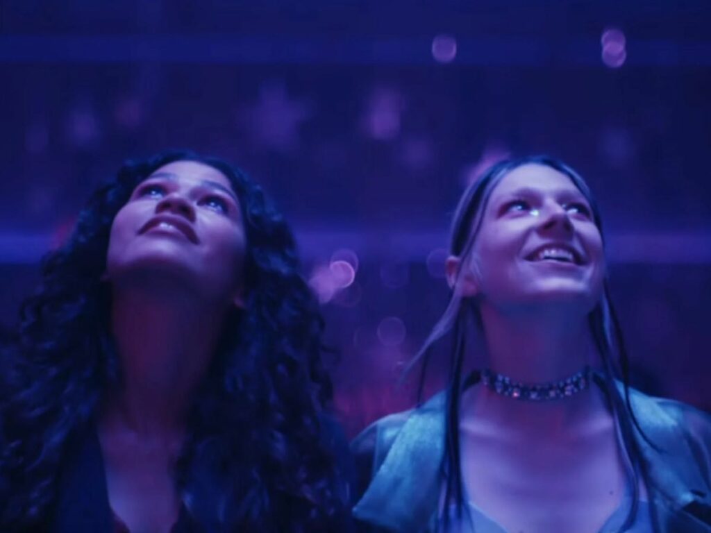
Similarly, the other characters are introduced via montages that utilize a signature color pattern, or use mood lighting to associate a set of emotions with the narrative. While Cassie Howard’s inner life is set to the pale tones of blues and cool whites to denote her loneliness, Jules Vaughn is often represented in shades of pinks, purples and vibrant magenta to signify her journey of femininity.
Color, Lighting, and Subtext
A Euphoria-centric aesthetic, if it can be called that, is sheer magnificence. Populated with mood lighting, neon highlights and varied hues of blue, pink and purple, it contributes to a rarified ethos of tasteful maximalism in film and television. One that’s become increasingly rare, if I may say so. One may wonder, if it actually serves the story, or if it is all a stylistic choice?
The short answer: yes, and yes. While the use of signature colors and striking lighting undoubtedly set it apart from contemporary teen dramas on television, they also serve to elevate the story that it ultimately seeks to tell. We already discussed how Levinson and Rev tried to center the feelings invoked in the characters and audience due to the occurrence of certain events in the plot, instead of the events themselves.
This plays out in a manner where the light and color help the audience navigate the emotional landscape of the character. The effect is as if they’ve entered a fever dream, and what a dream it truly is.
For example, when it comes to Nate Jacobs, grays and dull blues take over the frame. This hints towards his lack of warmth and feeling, and keeps us on our toes regarding his sinister intentions. Contrast this with the distinct, warm hues of orange, reds and pinks associated with a character like Jules. When these two finally confront each other, the blue-orange contrast that Rev mentions earlier is on full display, as seen below.

It is also important to note that despite all of its surrealistic stylings, Euphoria is a show deeply rooted in the reality of teen lives. Even if the lighting seems otherworldly, it is not set in a mode of fantasy. Rather, Rev uses and manipulates the set in such a way that character’s rooms, classrooms, washrooms, parties and bars are used as sources for lighting.
Combined with the long tracking shots, and dynamic camera movement, the show builds up an ambience that draws in the viewer into the world of the character. Consider this scene from season 2, episode 1, where Maddy unknowingly bangs on the restroom door while her friend Cassie has sex with her ex-boyfriend Nate on the other side. The camera follows her as she rapidly walks down the hallway, with the camera gradually pushing closer and closer. Shots like this reinforce the feelings of dread, anxiety and the constant fear of being found out that accompanies much of teenage life.
Cinematic References
Euphoria is a show which is very much informed by the cultural references of the moment. The show’s heavy involvement in creative imagery, coupled with the symbolism and vivid style, makes it rife with references. It’s apparent that every artistic comparison shown is deliberate, whether it be through vibrant color palettes or cultural comparisons via the lens of Hollywood blockbusters. Be it in terms of story, theme or genre, nothing is an accident.
Sam Levinson, the creator of Euphoria, has made it clear that he draws creative inspiration from other forms of art and pays homage to them through the program, just like any other artist.
This montage of Rue and Jules from season 2, referencing famous couples across film and art — The Birth of Venus, by Botticelli, Ghost, Brokeback Mountain, Titanic all make an appearance — is perhaps the best example, but other examples abound, such as Nate’s morning ritual which sees him immerse his head in water and rise back up, references the French film La Haine. This hints to his own troubled, at times violent and even hate-filled relationship with masculinity. Another such instance is Rue‘s stumbling filled drug stupor at a party, that cheekily evokes a visual connection to Inception, an iconic narrative about altered realities.
With characters frequently dressing up like iconic personas from films — Cassie as Alabama Worley from True Romance, Jules and Rue as the titular pair from Romeo & Juliet, the idea is to present a meta narrative that is counting on visual associations borne from years of pop culture and cinema to evoke a certain feeling in the audiences.
With the series finale of Euphoria season 2 only a few weeks old, we’re sure eagle-eyed fans will have found more visuals and aesthetics worth discussing. Which scene from Euphoria lives in your head rent-free? Did we miss any? Let us know in the comments below!


