Jerome Robbins’ West Side Story, conceived in 1957 with Stephen Sondheim, Leonard Bernstein and Arthur Laurents, is hallowed ground when it comes to musicals. Not only was it one of the most relevant and charged musicals of its era, but the 1961 film adaptation by Robert Wise and Robbins was critically acclaimed and set the tone for theatrical and musical adaptations in Hollywood.
Is it any surprise then, that director Steven Spielberg and frequent collaborator, cinematographer Janusz Kamiński, found that they had to reinvent the visual tone and texture of the musical film. While Spielberg had always loved and admired the genre, Kamiński was not very familiar with the high-flying dramatics and performativity of musical theater in filmmaking. Having grown up in Eastern Europe, the seven-time Oscar nominated director of photography was more suited to a realistic mode of documentation. However, one look at any frame of the film will tell you all you need to know — a gorgeous blend of grounded aesthetic and stylistic camera movement documents the streets of New York in the 60s.
In bringing a signature realism inspired from Old Hollywood romances, Spielberg and Kamiński have managed to reinvent the formal composition of the adaptation, while still staying true to its theater roots. Let’s take a look at what makes the cinematography of West Side Story so special.
Camerawork And Motion in The Musical Genre
What sets the musical theater and musical adaptation apart as a genre is the constant sense of motion. In live theater, this sense of motion is constant, a prerequisite for a good performance, almost. In order to utilize the full scope of the set, and keep things interesting for the audience, actors have to move around quite a bit. Of course, the musical numbers and dancing provide a more obvious solution for the same.
In a musical film, this is complicated by the fact that while the music and dancing is a crucial part of the narrative, it is intercepted by dialogue and more conventional storytelling elements. Thus, in order for the transition from spoken conversation between characters and musical interludes to not seem jarring, there needs to be a mode of camerawork that creates a constant sense of movement and shifting perspective. This helps create an immersive atmosphere, and keeps every scene interesting. This may also yield some beautiful tracking shots, or long takes, that show off the beauty of the set design and the scope of the film.
Kamiński took a similar approach while shooting the regular scenes as well as the musical numbers for West Side Story. The camera is constantly following the characters, and shifts seamlessly from one perspective to another. Instead of sticking to a god’s eye view or a wide shot that shows off the choreography in a song, he shifts the camera from its trajectory from one performer to another. For longer sequences, he either pulls the camera in or gradually pushes out to expand the frame and bring in new performers into the fore. This constant yet subtle, smoothly executed camera movement keeps the audience invested in the kinetics of a scene and helps the filmmaker avoid repetitive cuts.
Take, for example, the well-known song America. While the song starts out on the fire escape of a ramshackle building, the camera eventually moves out and follows the performers snake through the roads, shops and buildings outside. Even before that, the film just doesn’t randomly jump into it. Instead, it takes time to get to know the staging and the surroundings, showing an initially slow moving, pedestal-rigged shot of the locality where the characters live. The result is that this upward movement builds anticipation as well as familiarizes the viewer with their setting. In a way, the physical space of the set becomes as important as the characters.
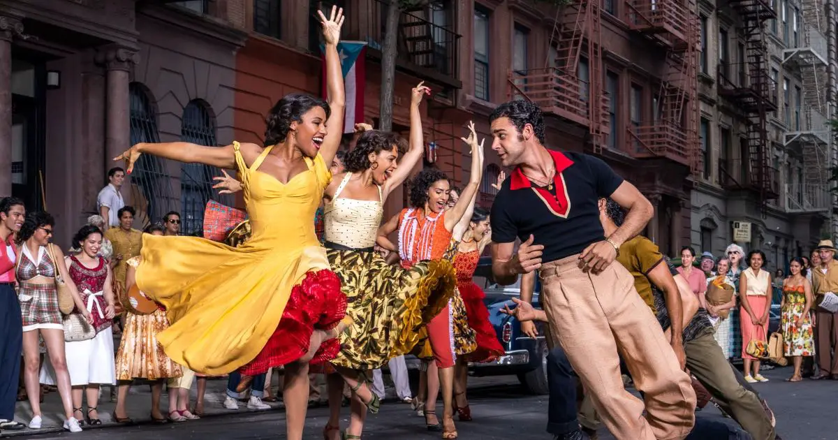
The pacing of the shots is also such that as more and more performers are introduced, and the song begins to pick up pace, so does the camera movement. It now morphs from slow close ups and medium shots to smooth dolly takes and sweeping wide shots that evoke the grand performances of Broadway and live theater. Alternating between horizontal and vertical framing of the action is also a deliberate choice, as it allows the audience to feel more involved with the action, as if they were right in the middle of it.
This also enhances the actual narrative of the film. As a lot of the number are sung by Puerto Rican characters in the film, the camera movement echoes the rushing Latin influences and calypso-inspired rhythm of the music itself. With each swish of the colorful skirts and each flamboyant lift, the film creates a new idiom of capturing highly stylised and choreographed movements.
Light and Color: Maintaining Visual Coherence
The film’s look and feel, on a surface level, may feel similar to the previous 1961 adaptation, but there’s a distinct contrast between the occasional pops of color, against the much grimier, desaturated backgrounds. The fact that his passion for the period is so apparent suggests the clear evocation of films from the 1960s and ’70s in general. Spielberg shoots on 35mm film (as usual) rather than digital, giving the picture a vintage appearance and a surviving link with its onscreen predecessor. Many directors would have felt compelled to update the remake, adding hints of contemporary styling and aesthetics, similar to what Rob Marshall achieved with steel gray and neon lit set pieces of the Academy Award-winning Chicago or Baz Luhrmann with the art deco sensibilities of Moulin Rouge!
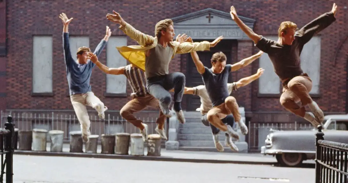
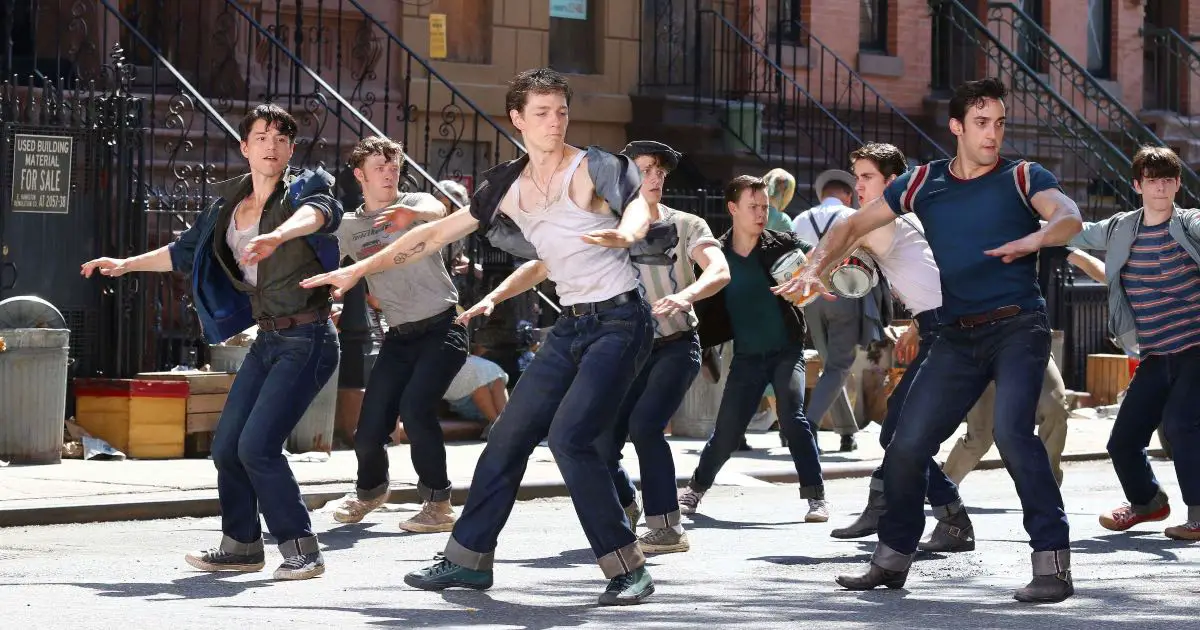
Notice the difference of the color and tone in the two images. While they both have the same range of saturation that shooting on film lends, the difference in brightness, further enhanced by radically different set designs, are obvious. Yet, they do not feel dissonant from each other.
Spielberg maintains the vintage feel, with his trademark creativity used in how he shoots each scene. Cinematography techniques that cause the camera to move through dance sequences have the effect of generating the impression that the audience is watching from within them, as we previously discussed. His and Kamińskis work retains its previous echoes of realism; this is, after all, a story that feels pretty grounded, with its tragedy of racial disparity, crime, and prejudice. But the stylistic flair that they do use, like flashes of color in form of fabric and props, an almost unreal sense of radiant light and staging, simply elevate the film, instead of making it into a fantasy.
The high style and Technicolor gloss of the first film, for example, have been traded for a grounded approach that uses plenty of cinematic license nonetheless. Where the 1961 adaptation used bright, perfectly toned colors to bring out the theatricality of the source material, Spielberg and Kamiński turn to light instead. Using a tremendous amount of additional key lights for the dancers and other crucial characters, their primary concern was to create visual consistency throughout day to night. The result is a gorgeously lit film that does not need much color correction.
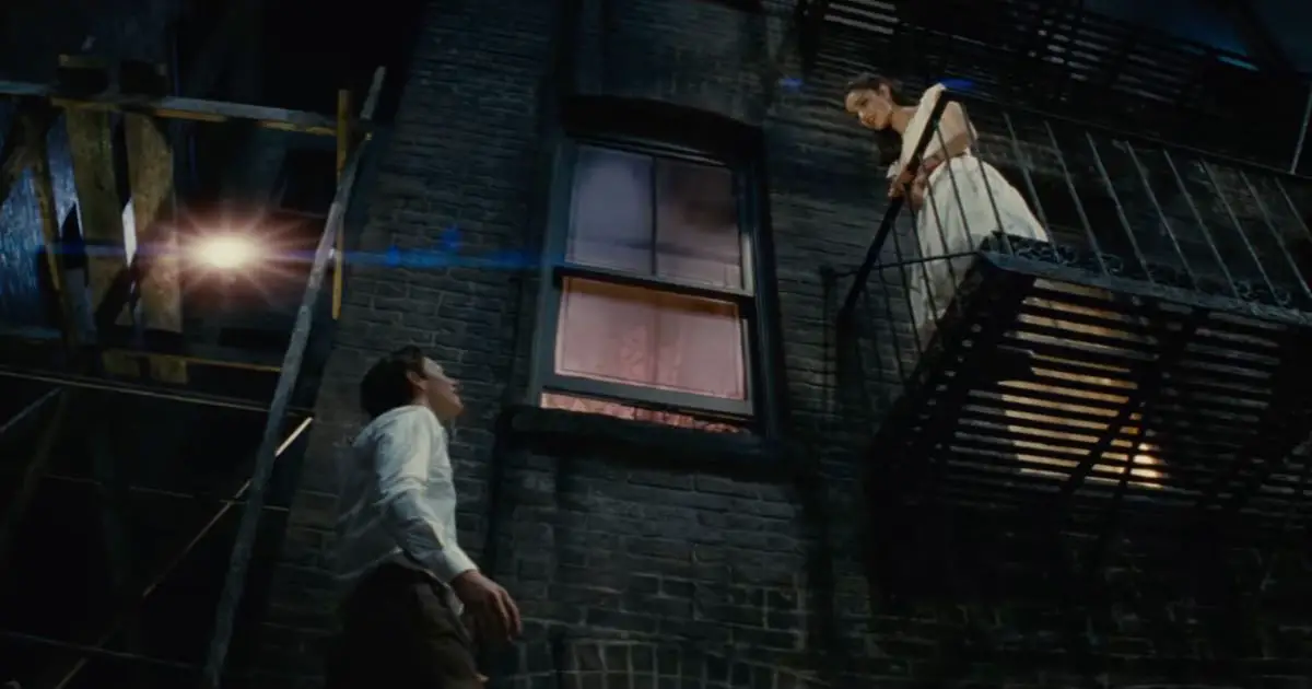
The light plays off beautifully from the characters clothing, to the set design itself, evoking the clean lines and silhouette shots of Old Hollywood romances and glamor shots of 40s films. This helps maintain the retro appeal of the film in a believable way.
Interplay of Genre and Aesthetic Choices
The songs themselves have been carefully constructed and written to enhance the emotional journey of each character. The moments in which they’re experienced are often interspersed with creative visuals and elaborate set pieces that explain what the music is about. I Feel Pretty, for example, initially starts as a low hum in a rundown department store that morphs into a hall of mirrors, to hint that the protagonist is now aware of a deeper self, and is learning to see herself anew. The resulting blend of traditional and contemporary makes West Side Story its own mutating narrative, bringing a distinct sensibility to the movie musical genre altogether.
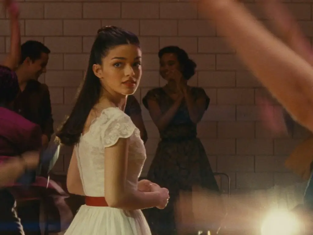
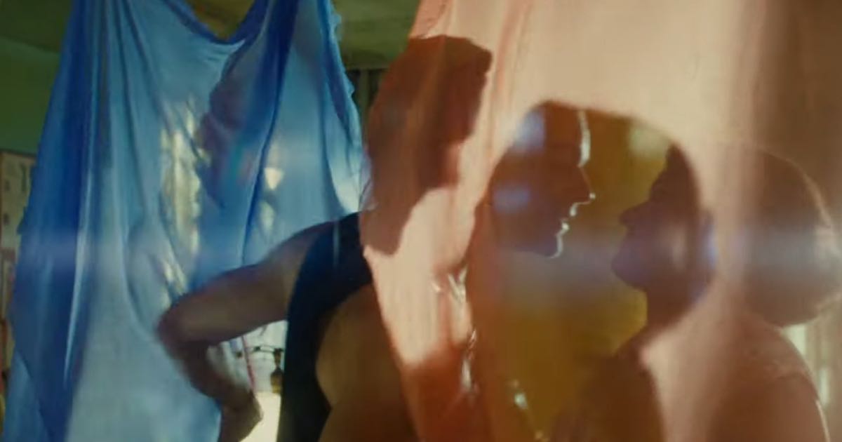
For example, when young lovers, Tony and Maria see each other across the room for the very first time, the arrangement of dancers in an ongoing musical number move away from the foreground and begin to recede, leading the audience to focus on the pair, mimicking how they themselves only have eyes for each other in this moment. Magical and toe-curlingly romantic, this feels straight out of a vintage daydream, and the stylistic choices the film makes are responsible for it.
(Note the moment from the 0:45 to 0:51 second mark in the trailer here)
In addition, the light around the two characters also refocuses, making it seem as if the pair are seeing each other under a spotlight. This aesthetic composition also helps contextualize their innocence and inexperience, particularly Maria‘s. The light creates an ethereal reflection around the white of her outfit, adding an angelic ethereality to the entire sequence. A small moment like this helps the audience see the way Tony sees her, as perfect and as the object of his affection.
Eventually, when they make their way to a balcony, the light effect pretty much remains the same, shining upon them with a soft focus while also highlighting the dust, grime and ramshackle nature of the buildings around them. In a way, it’s precisely this contrast between documentary realism and soft romance that makes the film so emotionally resonant, just through visuals alone.
Conclusion
According to both Spielberg and Kamiński, they aimed to be true to both the Old Hollywood glitz of the first movie adaptation of 1961 and the play’s Broadway roots. The outcome was a brilliant, yet believable palette of colors, immaculately neat lighting, and a sweeping vision of 1960s New York that came to life to tell the tale of unspeakable tragedy and young love. The film does not delude itself into thinking that it is an escapist fantasy of song and dance, or a spectacle of excess.
Instead, it utilizes a tasteful, tried and tested sophistication — the contrast of dark and light, gray and color — to tell a timeless story to a contemporary, evolving audience. The best thing is that even when narrating routine things, the film employs a bright, almost theatrical style that evokes its stage origins. The film’s numbers aren’t interested in reality, but rather the emotion of it, with Kamiński claiming that stripping away the theatricality of it would not have been right.
“It’s a love story, why be too delicate and subtle?”
And we couldn’t possibly agree more. What a triumph of a love story it truly is.

